Lower shelf works
You be the judge of these works that I am less than thrilled about. Let's figure out together what went wrong.This page will mostly be of interest to artists who wish to improve their skills and can glean some information by deciding what can be done differently next time a similar work is attempted. ----So lets critique it, and I will share with you what I would do differently.
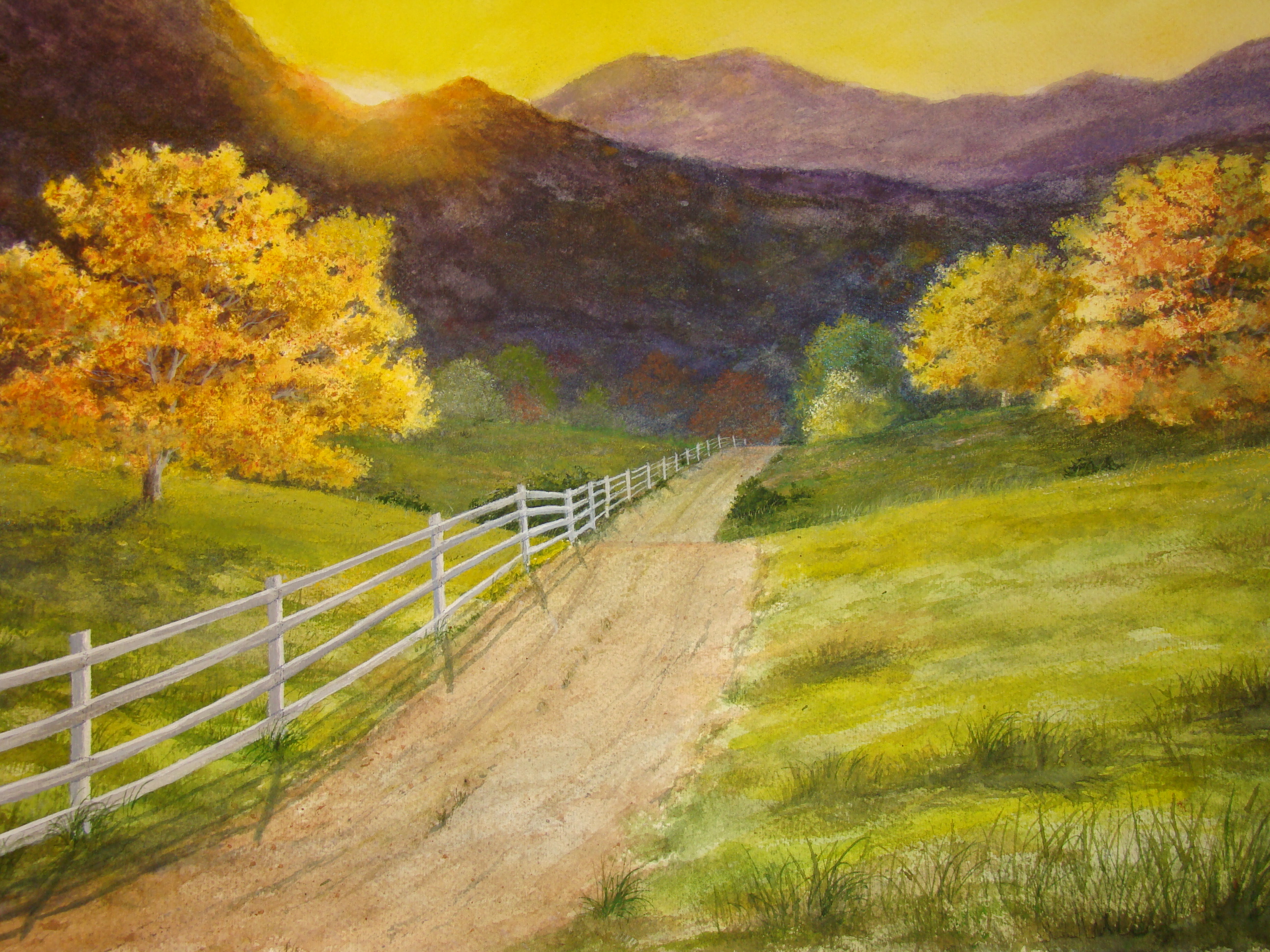  | This one is "Mountain Road sunset" Clever title isn' it? I sweated for nearly 10 seconds over what to name it. What I would like to see more than anything is a slightly brighter sun effect and a little less lemon yellow in the sky. Also I would darken the shaded areas down in the middle ground areas where the road disappears. This would probably make the sun brighter as well. Also the foreground trees, even though they are close, have the same fuzzy edges as the more distant ones in the middle ground. Atmospheric distance and humidity will blur an object in the distance, then the closer the object is to the viewer, the more crisp and well defined the edges (such as the leaves) will be. Painting the brilliant tree yellow and sienna first and texturing the leafy boughs, then shading slightly into shadow was the first step. Then after the water dries completely(which is what I think I neglected to do) shaping the background around the edges to give a pleasing leafy shape should give the separation of contrast. I think I didn't allow the yellow to dry completely, and capillary action caused the darker pigment to blur the edges.You can always expect water to act like water even if it is full of pigment. Drying thoroughly is necessary between steps, and failure to do so will find you out every time. If you use a hair dryer on the paper, be sure the paper has cooled down from the application, and then touch the area with the back of your hand. If the area feels cool to the touch, then it is still damp. |
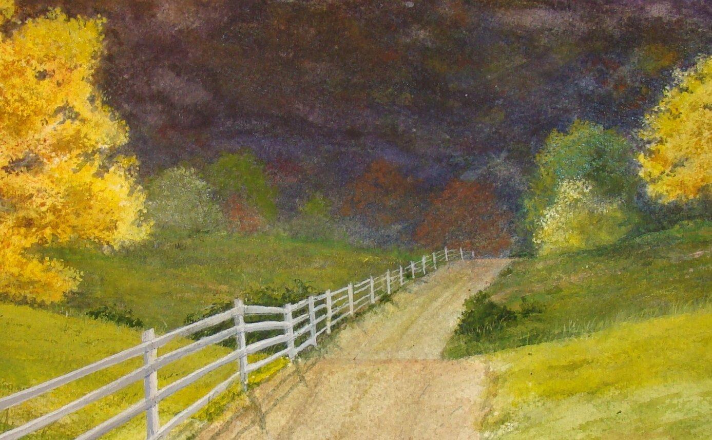
This close-up view shows the comparison of the two yellow trees,one distant and the one at left much closer, however they are both virtually identical in value and brilliance. Notice also that the left hand tree's edges are as fuzzy and blurred as the distant one. Now also look down the road at the vanishing point of the road and notice that the trees and distant base of the mountain are mid-range in value. This area should be much darker because of the distance from the light of the sun. Another dark indigo glaze of the area with the gradient going dark to lighter as it rises, would push the mountain back and bring the grassy pasture and road forward, as well as giving contrast to the sun without having to enhance the brightness with lighter color (chineese white goauche) | 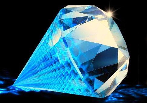 Not quite a diamond yet! although if some attention is given in the correct method, It will make a good painting. Don't be afraid to make a mistake, just plan ahead so there are fewer surprises |
A word about contrast and value in your work:
Often when judges at art shows are asked why they awarded winning or high status to any certain painting (be it water, oil, or whatever medium) , quite often one will hear statements like " I really liked the contrast and bold use of value in the painting, too safe an approach would have failed to make a good composition!" Indeed if you will ask yourself that same question about a painting you are impressed with, chances are it will be because of the contrast of the values when used next to each other. Contrast is simply the value or darkness of one color in comparison to the lightness of another, so one can hunt for effective places within the painting to use it best when planning the painting. The pleasing effect of contrast is clearly seen when diamonds are displayed on black velvet. Think of how the diamond on the right hand side of this page would look displayed against a light blue or yellow background.