More Lower Shelf Stuff
A closer look at less than a gem of a painting. Can it be salvaged or do I trash it? Let's do a critique...

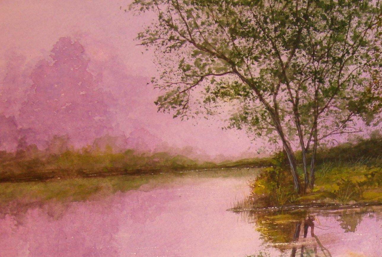
Mauve Morning (swan) By Timothy Fenwick
The main problem I had with this one is the water dynamics of the reflections. When light reflects off a surface, it is redirected to a certain extent due to the fact that a beam of light travels in a straight direction to the eye (in this case)
When a surface is less than mirror smooth, and in the case of water, moving and warping (even though it appears calm) the beams will bounce un-evenly off the surface and the effect is diffused and even slightly darker when it reaches the eye. This will cause a blurred and slightly fuzzy effect when compared to the object off which it reflects, which will be sharper. In this painting, the reflections of the trees are just as crisp and hard edged as the real trees themselves. A gentle stroke downward and then side to side would yield a slightly fuzzy and diffused effect. This is not true about every reflection in the composition, but in enough places for me to notice. The effect I see is one where the swan appears to be sitting on dry land. Even though the reflection of the swan itself is sufficiently distorted, there is not enough ripple effect in the wake it is leaving behind. The contrast of the ripple occuring in the middle of a very dark reigon, is not bright enough in contrast, and with watercolor, once there is pigment on the white of the paper, it will be dulled when compared with white paper. Only masquing the paper with a latex fluid will create enough of a barrier against dark paint, and the water will not reach the area due to capillary action.
The final problem I have with the painting is the brightness of the sky compared to it's reflection in the water. The sky will always always be lighter than it's reflection in water. In the case of this painting, the roles of the reflection and the real sky have changed places. The light of the sky is always brighter than the reflection because the less than perfectly smooth surface of the water causes some of the light to be re-directed away from the eye and not register on the retina of the eye. This will be interpreted automatically as darker in comparison by the brain.
The final flaw is the presence of what is called a cauliflower effect in the sky just to the top right tip of the large tree in the middle background to the left of the main body of the painting. Although this image doesn't show it clearly because of it's size, it is quite apparent in the original painting. The sky is the worst place a cauliflower can occur. They happen as a result of the paper being wet after a stroke of pigment and then stroking it again before it has had a chance to completely dry and set firlm. The extra water will flood into the damp area and push away some pigment which will result in a lighter, more transparent area shaped like a cauliflower. The trouble is that when it is the sky you are working on, the tone must be even in color and tone. About the only way to repair it is to turn the splotch into a cloud or put an object, such as another tree over it.
Here is a close up of the area with the cauliflower :
This view shows the cauliflower area at the top and right of the tallest mauve colored background tree. It appears as a bright spot in the sky which, although not really eye catching, is very noticeable when you spend as much time looking at the painting as I do. Just waiting for the sky to dry properly would have avoided the problem... The original painting being three times the size of this image, really amplifies the yellowish splotch,,yuck!